Wayfinding Signage System Promotes
Heritage Tourism in 14 Coastal Communities
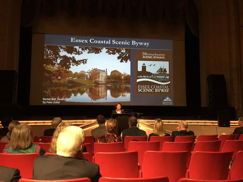
The Byway signage project that I started work on almost 5 years ago as designer for New Arts Collaborative has been officially completed! The official press release from the Essex National Commission is below.
"SALEM – The Essex National Heritage Commission (Essex Heritage) is pleased to announce the installation of directional signage along the Essex Coastal Scenic Byway, a state-designated route linking 14 coastal communities from Lynn to Salisbury. The wayfinding signage system is a key component of a tourism-based economic development initiative showcasing the region’s historic, cultural, and natural places.
Over 175 signs bearing the scenic byway logo are located on the state highways and municipal roads that form the approximately 90-mile byway designated by the state over a decade ago. The comprehensive signage system will direct travelers along the roadway and to the byway from access routes leading from Interstate 95, Route 128, and Route 1. From south to north, the byway communities are Lynn, Swampscott, Marblehead, Salem, Beverly, Manchester-by-the-Sea, Gloucester, Rockport, Essex, Ipswich, Rowley, Newbury, Newburyport and Salisbury.
“Essex Heritage is pleased to be partnering with leaders in the 14 byway communities to promote greater visitation to hundreds of unique North Shore destinations, many of which helped to define America’s historical and cultural legacy” said Essex Heritage CEO Annie Harris. “It’s a fitting tribute that through the development and promotion of the scenic byway these enduring local landmarks can continue to generate economic and quality of life returns for the businesses and residents of the coastal region.”
Envisioned as a sustainable form of economic development, the route of the Essex Coastal Scenic Byway was established by the state legislature in the mid-2000s. A comprehensive corridor management completed in 2011 identified directional signage as a top priority. The Essex Coastal byway is one of 15 state-designated scenic byways in Massachusetts.
The wayfinding signage system was funded by a grant from the Federal Highway Administration with matching funds provided by the Massachusetts Department of Transportation. The Essex Coastal Scenic Byway logo was designed by New Arts Collaborative. Engineering firm Greenman-Pedersen, Inc. developed the sign installation plan. The signs were fabricated and installed by RoadSafe Traffic Systems.
About Essex Heritage and the Essex National Heritage Area
Essex Heritage is the non-profit organization that manages the Essex National Heritage Area by developing programs that enhance, preserve, and encourage recreation, education, conservation and interpretation projects on Boston’s North Shore and the Lower Merrimack River Valley. The Essex National Heritage Area is comprised of the 34 cities and towns of Essex County, MA. For more information, visit www.EssexHeritage.org or call (978) 740-0444."
Contact:
Bill Steelman, Chief Operating Officer
(978) 740-0444 / bills@essexheritage.org


